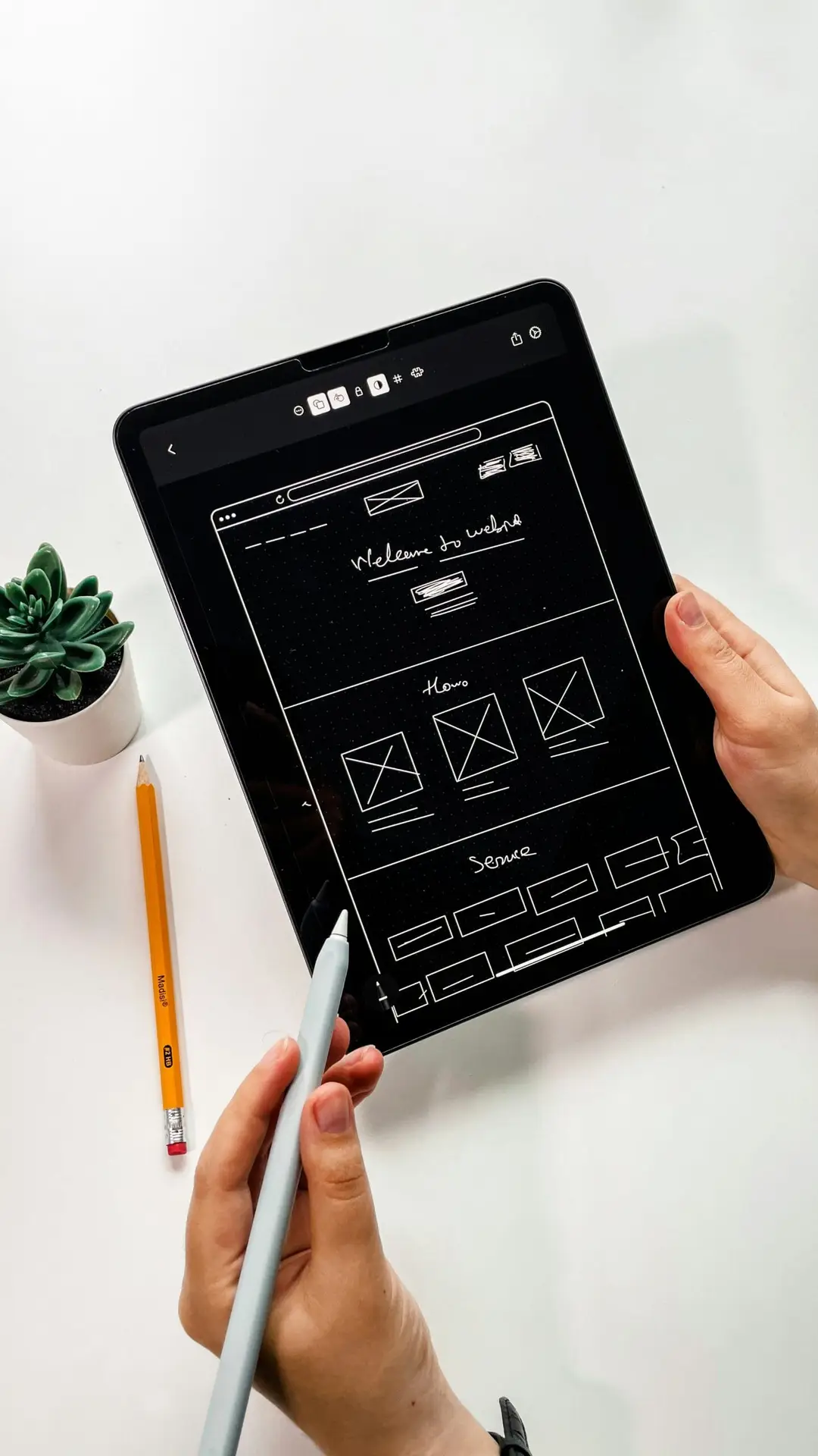
In 2025, mobile users are more discerning than ever. With millions of apps available on the App Store and Google Play, delivering a sleek, intuitive, and engaging user experience (UX) is no longer optional—it’s essential. Whether you’re designing for iOS or Android, the success of your mobile app depends on how well your UI/UX drives user engagement.
we’ll explore best practices for designing high-performing mobile interfaces tailored to both platforms. We’ll cover platform-specific guidelines, shared UX principles, and design strategies that improve retention, increase session times, and boost conversions.
Why Mobile Engagement Matters?
Mobile engagement refers to how users interact with your app—how often they open it, how long they stay, and how many features they use. Great UI/UX design fosters habits, reduces churn, and encourages deeper in-app activity.
Benefits of high engagement:
- Increases customer lifetime value
- Reduces user acquisition costs
- Improves app store ratings and reviews
- Strengthens brand loyalty
Apps that prioritize engagement-focused design outperform competitors by creating emotional connections and seamless experiences.
Understanding the Differences: iOS vs. Android Design
Before jumping into design strategies, it’s essential to understand the fundamental differences between iOS and Android environments. Each platform has its own design language, navigation conventions, and interaction behaviors.
iOS Design (Apple Human Interface Guidelines)
- Navigation: Bottom tab bars, swipe gestures, consistent back button in the top-left
- Design Language: Clean, minimal, focus on depth and motion
- UI Elements: Segmented controls, pickers, date selectors with native styles
- Safe Areas: Design must accommodate the notch and dynamic island (iPhone)
- Typography: Uses San Francisco font (by default)
Android Design (Material Design 3)
- Navigation: Navigation drawers, top tabs, FAB (floating action button)
- Design Language: Bold, colorful, layered with elevation
- UI Elements: Cards, chips, switches, contextual menus
- Screen Sizes: Wide variety of resolutions and aspect ratios
- Typography: Uses Roboto or Google Sans
Respecting platform conventions helps users feel at home and reduces the learning curve.
Core UI/UX Principles for Both Platforms
Despite platform differences, the fundamentals of great UX remain universal.
1. Simplicity First
Clutter is the enemy of engagement. Your app should help users accomplish their goals quickly and clearly.
Tips:
- Keep primary actions prominent
- Use whitespace for breathing room
- Limit content per screen to one main task
2. Consistency
- Visual and functional consistency builds trust and reduces confusion.
- Reuse components across screens
- Maintain consistent iconography and colors
- Align with platform design systems (SF Symbols, Material Icons)
3. Accessibility
- Design for all users, including those with disabilities.
- Provide sufficient color contrast
- Use large tap targets
- Enable dynamic type (iOS) or scalable text (Android)
- Add voiceover/ TalkBack support
4. Feedback and Responsiveness
- Let users know that the app is listening and responding to their actions.
- Use animations, loading indicators, and transitions
- Show error states and confirmations clearly
- Avoid freezing or lag—optimize for smooth performance
Designing the Engagement Funnel
A user’s journey in your app can be mapped to an engagement funnel:
1. First impression (Onboarding)
2. First success (Activation)
3. Habit building (Retention)
4. Long-term loyalty (Advocacy)
Let’s break down how UI/UX can improve each stage.
Stage 1: Onboarding That Hooks Users
Your onboarding flow is critical. It sets expectations and drives early engagement.
iOS Tips:
- Use “Sign in with Apple” for quick registration
- Minimize permissions until necessary (e.g., location)
Android Tips:
Integrate with Google sign-in
Guide users with Material “Coach Marks” (highlight new features)
General Best Practices:
- Keep it short (3–4 screens max)
- Use animation or interactivity to demonstrate features
- Offer the option to skip onboarding
Good onboarding boosts Day 1 retention by helping users experience value quickly.
Stage 2: Intuitive Navigation and Flow
Make it easy for users to explore the app and discover features.
Navigation Patterns:
| Action | iOS | Android |
|---|---|---|
| Main sections | Tab Bar | Bottom Nav or Navigation Drawer |
| Secondary actions | Modal sheets | FAB or Overflow Menu |
| Back gesture | Edge swipe or top-left button | Back button or gesture |
Stage 3: Micro-Interactions and Delight
Micro-interactions are subtle animations and feedback elements that improve user engagement and satisfaction.
Examples:
- Heart icon pulses when liked
- Swipe-to-archive with smooth transitions
- Pull-to-refresh with animated indicators
- Animated transitions between screens
- These small details humanize the app and reinforce behaviors.
Stage 4: Notifications and Re-Engagement
Push notifications are a double-edged sword. When done right, they drive re-engagement. When overused, they lead to uninstalls.
Best Practices:
- Make opt-in optional and explain the benefit
- Personalize based on user behavior (e.g., cart abandonment, new content)
- Schedule based on user time zones and activity history
- Deep link directly to relevant app sections
- Use in-app reminders or banners for non-intrusive prompts.
Stage 5: Personalization and Adaptive UI
Apps that feel personal keep users coming back.
Ways to personalize:
- Offer a custom dashboard or homepage
- Adapt content based on behavior or preferences
- Allow UI customization (e.g., themes, font sizes, layouts)
AI-driven personalization in 2025 enables mobile apps to adapt interfaces in real time, creating context-aware experiences that boost engagement dramatically.
Platform-Specific Engagement Features
iOS Engagement Boosters
- Widgets: Let users pin app features to their home screen
- Haptic Feedback: Use subtle vibration to confirm actions
- App Clips: Offer lightweight previews without full installation
Android Engagement Boosters
- Home screen shortcuts: Quick access to key app actions
- Material You: Let users theme your app to match their OS colors
- Foreground services: Persistent notifications for ongoing tasks (music, fitness)
- Use these OS-level tools to deepen interaction and visibility.
- Data-Driven UI/UX Optimization
- Track and measure to understand what drives engagement.
Key Metrics:
- Daily/Monthly Active Users (DAU/MAU)
- Session length and frequency
- Time to first action
- Feature adoption rate
- Drop-off points in key flows
Tools:
- Firebase for analytics and A/B testing
- Mixpanel or Amplitude for event-based tracking
- UXCam or Smartlook for session replays and heatmaps
Test variations of layout, CTA wording, button placements, and onboarding flows regularly to refine the experience.
Real-World Examples
Instagram maintains high engagement through an intuitive tab-based structure, swipe gestures, real-time interactions (likes/comments), and personalized explore pages.
Headspace
Headspace’s calming visuals, guided onboarding, and progress tracking keep users committed to daily meditation habits.
Strava
Strava leverages social proof, gamification (badges, leaderboards), and personalized challenges to keep users coming back for workouts.
Common Pitfalls to Avoid
- Overloading users with features: Focus on core value
- Non-native UI patterns: Don’t use iOS-style UI on Android and vice versa
- Poor mobile performance: Optimize for speed and smoothness
- Ignoring accessibility: Excludes a large audience and damages usability
- No feedback or confirmations: Leaves users unsure of what’s happening
Final Thoughts
Engagement isn’t just about getting users into your app—it’s about keeping them there. By designing with empathy, leveraging platform conventions, and continuously optimizing based on real data, you can create mobile experiences that users love.
Whether you’re building for iOS, Android, or both, focus on clarity, responsiveness, and emotional connection. Apps that master UI/UX don’t just get used—they become part of users’ daily lives.
In 2025 and beyond, design is not just how your app looks—it’s how it feels, functions, and forms lasting user habits.