In today’s competitive digital landscape, a landing page can make or break your marketing efforts. Whether you’re capturing leads, promoting a product, or launching a campaign, a high-converting landing page is essential for success. But what if you’re not a developer? Thanks to no-code tools like Figma and Webflow, anyone—from solo founders to marketers—can design…
In this article, we’ll explore the art and science of high-converting landing page design, show how to create one using Figma and Webflow, and unpack best practices that drive engagement, trust, and conversions.
What Makes a Landing Page “High-Converting”?
A high-converting landing page isn’t just beautiful—it’s strategic. Its goal is to persuade a visitor to take a specific action, such as:
- Signing up for a newsletter
- Downloading an ebook
- Purchasing a product
- Booking a call or demo
To achieve that, it must be focused, fast-loading, emotionally engaging, and easy to navigate.
Key Elements of High-Converting Pages:
1. Clear value proposition
2. Compelling headline
3. Scannable content and visuals
4. Trust signals (testimonials, badges, etc.)
5. Strong CTA (Call to Action)
6. Minimal distractions
7. Mobile responsiveness
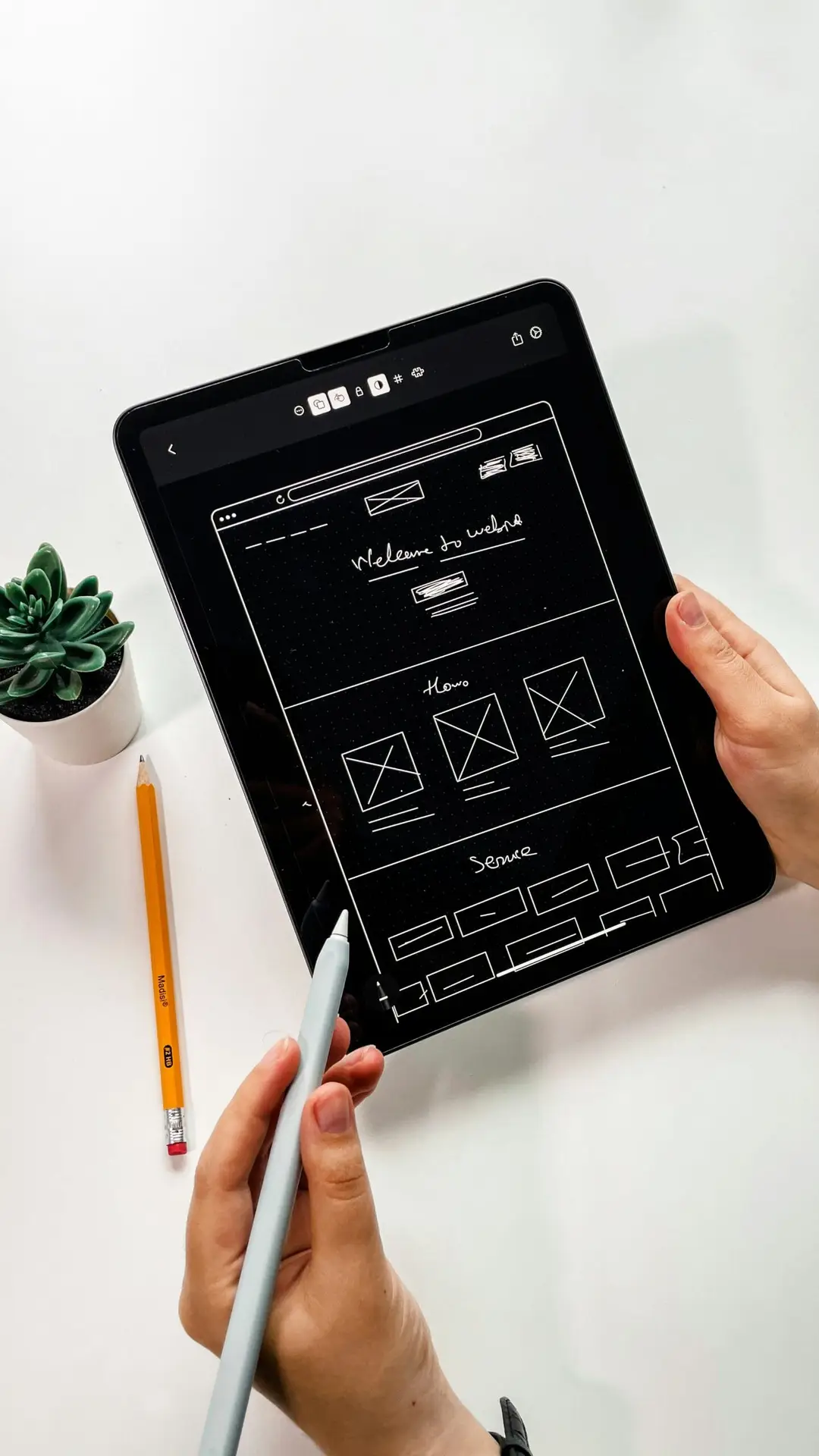
Step 1: Wireframing in Figma
Figma is a powerful, cloud-based design tool ideal for creating wireframes and high-fidelity designs—even if you’re not a designer by trade.
Start with a Layout
A standard high-converting landing page includes:
1. Hero section – Headline, subheading, CTA, and imagery
2. Benefits or features section
3. Social proof (logos, testimonials, reviews)
4. Supporting content – How it works, videos, screenshots
5. Final CTA or form
6. Footer with legal links
Tips for Figma Wireframes:
- Use Figma’s free wireframe kits or community templates
- Design mobile-first if your traffic is mobile-heavy
- Group components logically with auto layout
- Use simple rectangles and text to represent structure
- Keep content short—landing pages are not blogs
- At this stage, focus on structure, not styling.
Step 2: High-Fidelity Design in Figma
Once your layout is validated, convert the wireframe into a pixel-perfect visual design.
Visual Design Best Practices:
- Typography: Use 1–2 fonts with clear hierarchy (e.g., headline, body, CTA)
- Color: Use contrasting colors for CTA buttons to stand out
- Imagery: Use product screenshots, illustrations, or hero images that align with your message
- Whitespace: Don’t cram everything—let your design breathe
- Icons: Use Figma plugins to add meaningful icons
Figma Plugins to Speed Up Workflow:
- Iconify – Free icon sets
- Content Reel – Dummy text, names, and images
- Unsplash – Free stock images
- Autoflow – Connect UI elements visually
Once your design is final, you’re ready to bring it to life in Webflow.
Step 3: Building in Webflow (No-Code)
Webflow is a no-code website builder that gives you full control of layout, interactions, CMS content, and responsiveness—without writing a line of code.
Why Webflow for Landing Pages?
- Visual drag-and-drop builder
- Clean, fast-loading code output
- Built-in hosting and SEO tools
- CMS support for dynamic content
- Interactions and animations without JavaScript
Steps to Build Your Page:
1. Create a New Webflow Project
Choose a blank canvas or start from a template
2. Set Up the Global Style Guide
Define fonts, colors, and spacing (match your Figma design)
3. Recreate the Figma Layout
Use div blocks for structure, containers for sections, and flex/grid for layout
Add headings, paragraphs, images, and buttons accordingly
4. Add Interactions
Animate CTA hover states, scroll effects, or modals with Webflow’s built-in interaction tools
5. Connect Forms
Link your form to Webflow Forms, Mailchimp, Zapier, or your CRM
6. Optimize for Mobile
Use Webflow’s responsive design tools to tweak layouts for tablet and mobile views
With Figma-to-Webflow, you go from visual concept to functional page—no developer needed.
Conversion-Centric Design Tips
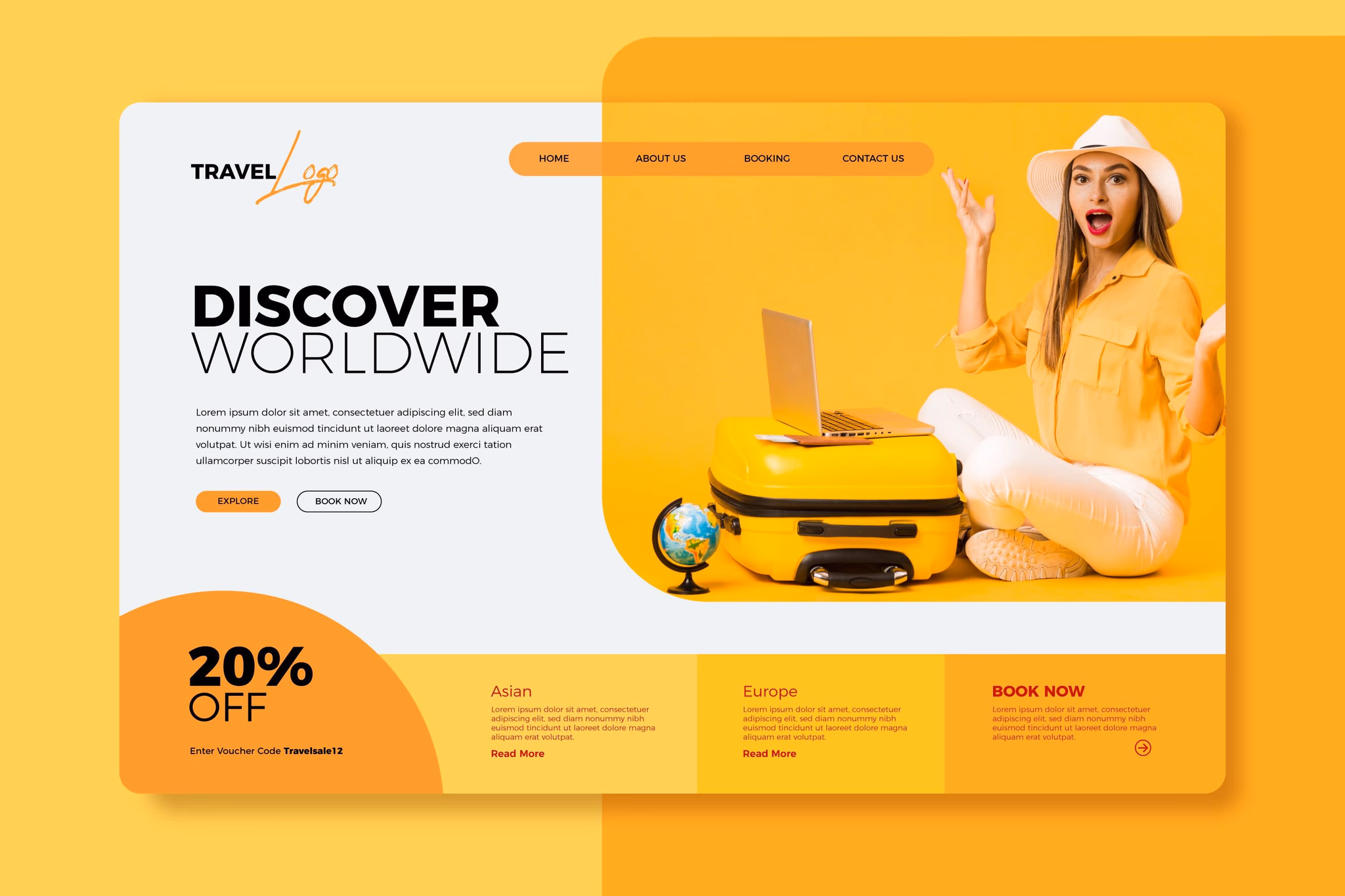
1. Optimize Your Hero Section
- Your hero is the first thing users see. Make it count.
- Clear headline: State your value in 8–12 words
- Supportive subhead: Explain the “why” or “how”
- Strong CTA: “Get Started,” “Try Free,” “Download Now”
- Eye-catching visuals: People respond to faces and product screenshots
Example:
“Track Your Work. Optimize Your Time.”
“All-in-one time tracking tool for teams and freelancers.”
[ Start Free Trial ]
2. Use Social Proof
Trust is a conversion trigger. Include:
- Testimonials with names/photos
- Logos of well-known clients
- User count or review ratings
- Case studies or video testimonials
Tip: Avoid fake reviews—authenticity matters.
3. Create a Focused CTA
Every landing page should have one primary action. Avoid multiple conflicting CTAs like “Learn More” and “Buy Now” on the same screen.
Make the CTA:
- Visually prominent (button color, size)
- Action-oriented (verb + benefit)
- Repeated throughout the page
4. Remove Distractions
- High-converting pages remove friction. Avoid:
- Navigation menus that lead users away
- Walls of text
- Pop-ups or unnecessary modals
- External links in key sections
- Use one page, one purpose.
- Launch and Optimization
Pre-Launch Checklist:
- Mobile responsiveness
- Fast load speed (optimize images, use Webflow’s hosting)
- SEO settings (title, meta description, alt tags)
- Google Analytics and tracking pixels installed
- Test form submissions
- After Launch: A/B Testing
Use tools like:
- Google Optimize
- Convert
- Webflow + Zapier + Airtable (for no-code tracking setups)
Test:
- CTA copy and color
- Headline variations
- Page length (short vs. long form)
- Testimonials vs. case studies
- Even small changes can lead to a 20–50% boost in conversions.
- Real-World Example: SaaS Landing Page Flow
Let’s walk through an example: a SaaS company offering team productivity software.
Wireframe Structure in Figma:
1. Hero: Headline, subhead, CTA, laptop image
2. Benefits: 3 columns with icons and text
3. Testimonials: 3 user quotes with avatars
4. Product preview: Screenshot with annotations
5. Final CTA: Sign-up form or button
6. Footer: Social links, privacy policy, FAQ
Visual Design in Figma:
- Bold font (Inter or Poppins)
- Primary CTA in bright green
- Soft blue/gray background
- Subtle animations or shadows
Webflow Build:
Use flex layout for benefit sections
Add fade-in animation to testimonials
Mobile layout with collapsible menus
Integrated with HubSpot for lead capture
Result: A polished, professional, and conversion-focused landing page ready to promote across ads, email, and social media.
The No-Code Advantage
Using Figma + Webflow together brings speed, agility, and creative freedom:
| Feature | Figma | Webflow |
|---|---|---|
| Design | Wireframes, visuals, prototypes | Layouts, styles, animations |
| Interactions | Micro-interactions via plugins | Click, hover, scroll-based UX |
| Responsiveness | Device previews | Live responsive design tools |
| Collaboration | Commenting & sharing | Live preview and editing |
| Export/Publishing | Share designs or handoff specs | Direct publish to live URL |
Together, they eliminate the handoff gap between design and development—cutting project time in half while improving consistency and output quality.
In 2025, the ability to design high-converting landing pages isn’t limited to developers or large design teams. With no-code tools like Figma and Webflow, anyone can prototype, design, build, and launch compelling pages that drive real results.
By combining strategic design, user-centered thinking, and powerful tools, you’ll create landing pages that don’t just look great—but convert. Whether you’re launching a new product, testing an idea, or scaling a SaaS brand, mastering this no-code workflow is a growth superpower.